
Want to save money on screen printing ink?
The answer is simple: standardize your ink selection. I’ll show you how.
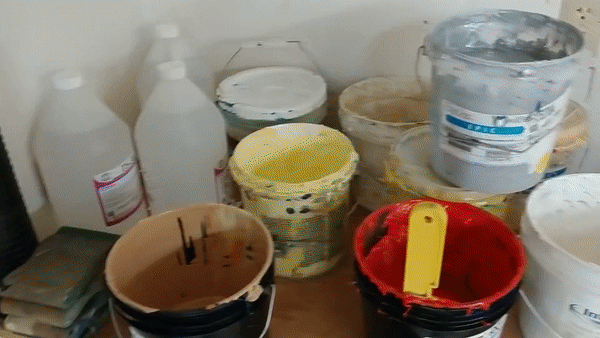
Screen printers love to show off their collections of custom-mixed inks. You’ll see these colorful pictures on any print shop’s Instagram:
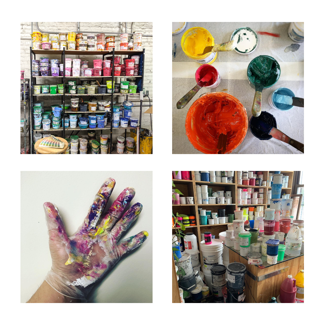
A lot of print shops brag about Pantone matching. They show off hundreds of small cups of customized ink sitting in their shop. They advertise that they can mix any custom color.
But at my shop, we don’t.
Don’t do a lot of Pantone matching!
Pantone matching doesn’t make a lot of sense for the average screen printing shop that mostly prints for local businesses, organizations, teams, churches, and schools.
Custom Pantone matching can turn into a profit-eating monster.
Without a clear policy for when you will and won’t do Pantone matching, here’s what happens:
- Low productivity rates.
- More misprints.
- Unhappy customers.
- More expensive ink and labor costs.
- Waste: space, ink, time
We will mix custom colors if we have to! But we don’t offer it right off the bat. If I’m trying to win over a high-profile client, I will definitely let them know that we can do custom Pantone matching.
View this post on Instagram
I’m much more likely to advertise our online stores than Pantone matching. That adds real value – and custom color matching isn’t part of our primary business model.
Our details for custom color matching are in fine print at the bottom of our standard ink menu – “For orders over 100 pieces, we will mix custom colors. Otherwise, we charge $100 per custom color”.
That $100 for Pantone color matching does two things: it stops people from asking about color matching and it makes color matching more valuable.
Note: there are some very real exceptions here! Print shops like Night Owls and Printed Threads specialize in Pantone matching. They make it a core component of their business because they’re extremely good at it. Custom colors are part and parcel of their services – not a tacked-on extra.
Reduce the number of screen printing inks in your shop
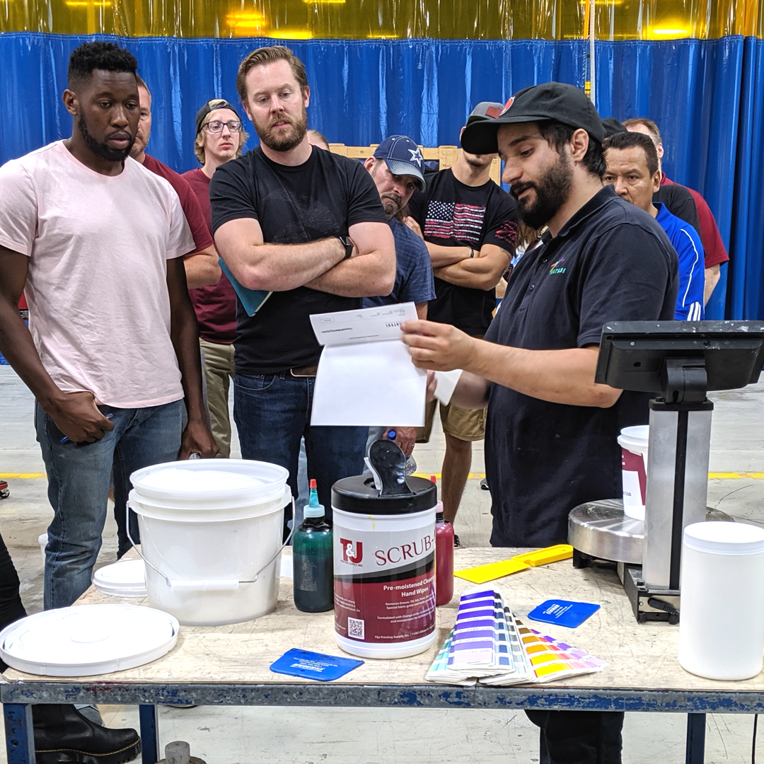
Custom ink mixing is an art.
Learning to mix ink correctly and consistently requires significant investment in the form of research and development. Typically, only one or two shop employees can mix inks up to professional standards.
No matter which ink mixing system, Pantone book, or special trick you use – ink mixing requires incredible attention to detail. Even if you carefully follow ink recipes, your mixtures may require “fudging” (read: trial-and-error) to get the perfect color match.
Every screen printer should understand that ink colors will appear differently depending on the chemistry of the ink, garment, and curing process.
“Navy” can look very different according to:
- Brand of ink
- Type of ink
- Type of t-shirt
- Underbase or no underbase
- DTG, screen print, or transfer
- The light the color is inspected under
- And a huge variety of other variables.
Reducing waste is the easiest way to save money on screen printing ink.
There is a lot of waste when you mix custom inks.
Here’s how you lose money when you go overboard with custom colors and inks:
- You mix too much screen printing ink. Typically, you will mix more than you need (since combining fractions of a gram is very difficult).
- You purchase too much screen printing ink. Your actual ink consumption doesn’t go up, but you do wind up keeping more on-hand because it seems like you’re using more ink
- You waste space. Shelves and shelves of custom ink take up space you can use for revenue-driving activities.
- Your standards vary… You may be within one shade on one job, but way off on the next. Unless you have strict quality control and expensive color matching equipment, your actual color matching can easily vary from job to job.
- …which leads to more spoilage and misprints. Your team miscommunicates about a color and the entire run is ruined. Customers may be extremely discerning about color matches and reject jobs you judged as “good enough.” Worse still, I’ve heard of shops re-printing an order because the colors “weren’t right” – only to discover the customer could care less!
- Your R&D budget balloons. If you’re not budgeting for some research and development, you’re making a mistake – but if you’re financing an on-site education in Pantone matching, your R&D budget is likely out of control.
- Your sales, design, and production departments struggle to communicate about colors. Sales is the first step in the production process, right? What they do filters down to artists, then to your production staff. If sales, design, and production can’t talk about colors easily and effortlessly, that is wasted time!
Over time, there will be thousands of dollars of ink sitting in your shop, taking up space, never to be used again.
Every time you add another color to your library, you add complexity to your print shop.
You create more options, more choices, and more opportunities to make mistakes. Your sales team struggle to define the exact color, your designers scramble to figure out the color requirements, your production team walk around the shop and struggle to find the right inks.
Custom Pantone matching creates picky and demanding customers
Do you believe your customers demand unique Pantone matches?
With a few exceptions, this simply isn’t the case.
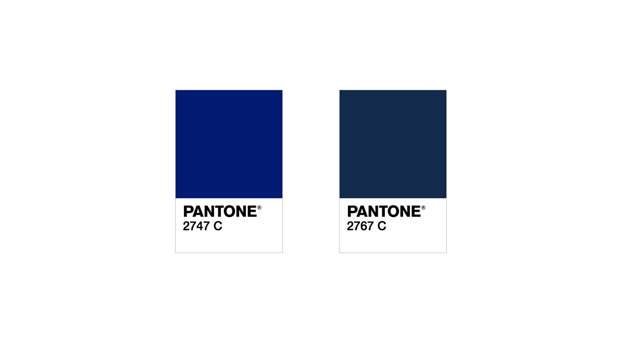
Customers (and even experienced printers) can’t tell the difference between Pantone 2747C and 2767C once it’s actually on a shirt, so why create two options? It’s just Navy!
Giving too many options to your customers creates analysis paralysis. “You can have any color you want!” sounds great…until it comes time to actually choose colors.
This process slows their decision making. It introduces complexity into your production process. And it has one negative effect that’s very hard to deal with: unhappy customers because of buyer’s remorse.
Custom color matching can make customers unhappy, even if their order went exactly to plan. Here’s how this works: your customer thinks, “What if it was a slightly better shade of blue?” They imagine a better product, or wish they’d gone with different colors. Buyer’s remorse sets in.
Second-guessing doesn’t happen if they are told, right from the start, “This is the blue we print in our shop.”
Cut out waste: creating a standard chart of screen printing ink colors
“Many people settle for eliminating the waste that everyone recognizes as waste. But much remains that simply has not yet been recognized as waste or that people are willing to tolerate.” – from the Toyota Production System’s core tenets
At Campus Ink, we have 44 stock colors and 8 specialty inks.
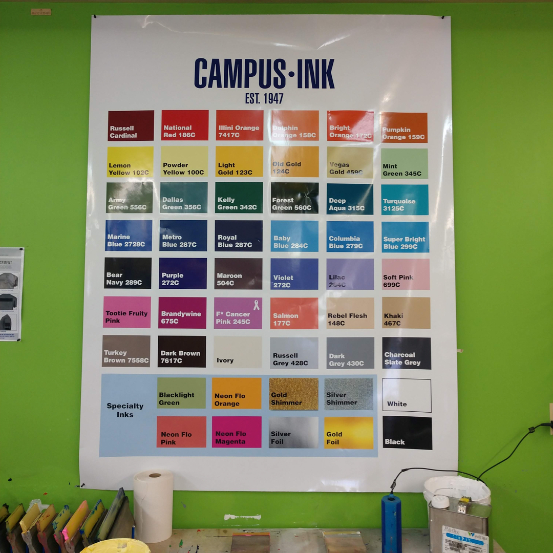
We chose these colors because they represent the most common shades of the most common colors that we print. It’s extremely rare that we can’t find a way to match these colors to 95% of the artwork we do for screen printing.
The interesting thing? 44 colors are way more than enough to satisfy our most selective university customers.
Let’s talk about how and why this system works (and how you can do it too).
How to standardize your screen printing inks
To standardize your ink colors today, schedule the afternoon to go through your ink collection and purge the waste. Don’t worry about those small cups of custom colors – start fresh.
Create a color card with the standard ink colors you’ll offer to customers.
Then, create a custom swatch in Adobe Illustrator (or Corel).
You can use this swatch in two powerful ways:
- Install it on your designer’s computers.
- Offer it to customers that do their own artwork.
Then, print a large version of your swatch and hanging it throughout your shop.
Sales staff, artists, and production staff should all have an easily accessible way to glance at your standard inks.
From there, you’ll want to name your inks with simple color names. This seems silly – but it cuts down on confusion internally and externally.
Each color we’ve chosen has been given a unique name that we chose. Some are fun (Tootie Fruity Pink, Turkey Brown) while others are straight to the point (Illini Orange, F*ck Cancer Pink). You can use these names to put some personality into the process – it’s a lot more fun to talk about Tootie Fruity Pink than Pantone Pink C.
This makes it super easy to refer to inks – whether we’re dealing with sales staff, designers, or production workers. Everyone uses the same vocabulary and simple names to refer to ink colors.
Standards equal efficiency and simplicity
I’ve traveled across the country and seen print shops of every size have thousands of dollars of unused ink sitting in their shops.
You can absolutely make a niche out of custom Pantone matching – but it’s not something every print shop needs. It’s much easier, faster, and better for your team to use a standardized palette of inks.
Standards and documentation for every activity in your shop – sales, artwork, production – make autonomous and engaged employees. Ultimately, standards save money by reducing waste.
To save money on screen printing ink, take the following steps to standardize colors in your shop:
- Audit your ink collection.
- Throw away old custom mixed inks.
- Identify the most common colors you print.
- Make a swatch of your most common colors.
- Align your ink choices with the brands of ink you use.
- Name and label your colors.
- Create an Adobe Illustrator swatch for your shop (and offer it to customers if needed).
- Print your color swatch and hang it throughout your shop.
- Consider offering custom matching at a premium.
- Guide your customers toward better designs.
The amazing SHIRT KONG embarked on this journey. They report that it’s made things much simpler – from sales to art.

MacDermid Connect (Thumbnail)
Kingsland Printing (Top image)

0 Comments